
The product page that sells: 12 must-have elements
Headline, photos, price, reviews, bundles, FAQ, mobile: the 12 elements of a Shopify product page that converts, with examples from real stores.
By the ThemeDrop team10 min read
Key takeaways
- Visitors decide in seconds: headline, photo, price and button must be visible without scrolling.
- Sell the outcome for the customer, not the product specs.
- Bundle offers raise the average order without costing more in ads.
- Compare-at prices, reviews and urgency must be true: it's the law, and it's what keeps trust.
Contents
- 1. A headline that says what the product does
- 2. Reviews visible at the top
- 3. A clear price, and an honest compare-at price
- 4. Three short benefits
- 5. An add-to-cart button you can't miss
- 6. A second path to purchase
- 7. Photos that show the product in use
- 8. Reassurance, right under the button
- 9. A description that sells the outcome
- 10. Bundle offers to raise the order value
- 11. An FAQ and a guarantee that remove the last doubts
- 12. A page designed for mobile first
- The product page checklist
- Frequently asked questions
On a one-product store, the product page does nearly all the selling. Visitors often land there from a video or an ad, on their phone, without knowing you. Within seconds, they must understand what the product does, why they need it and why they can trust you.
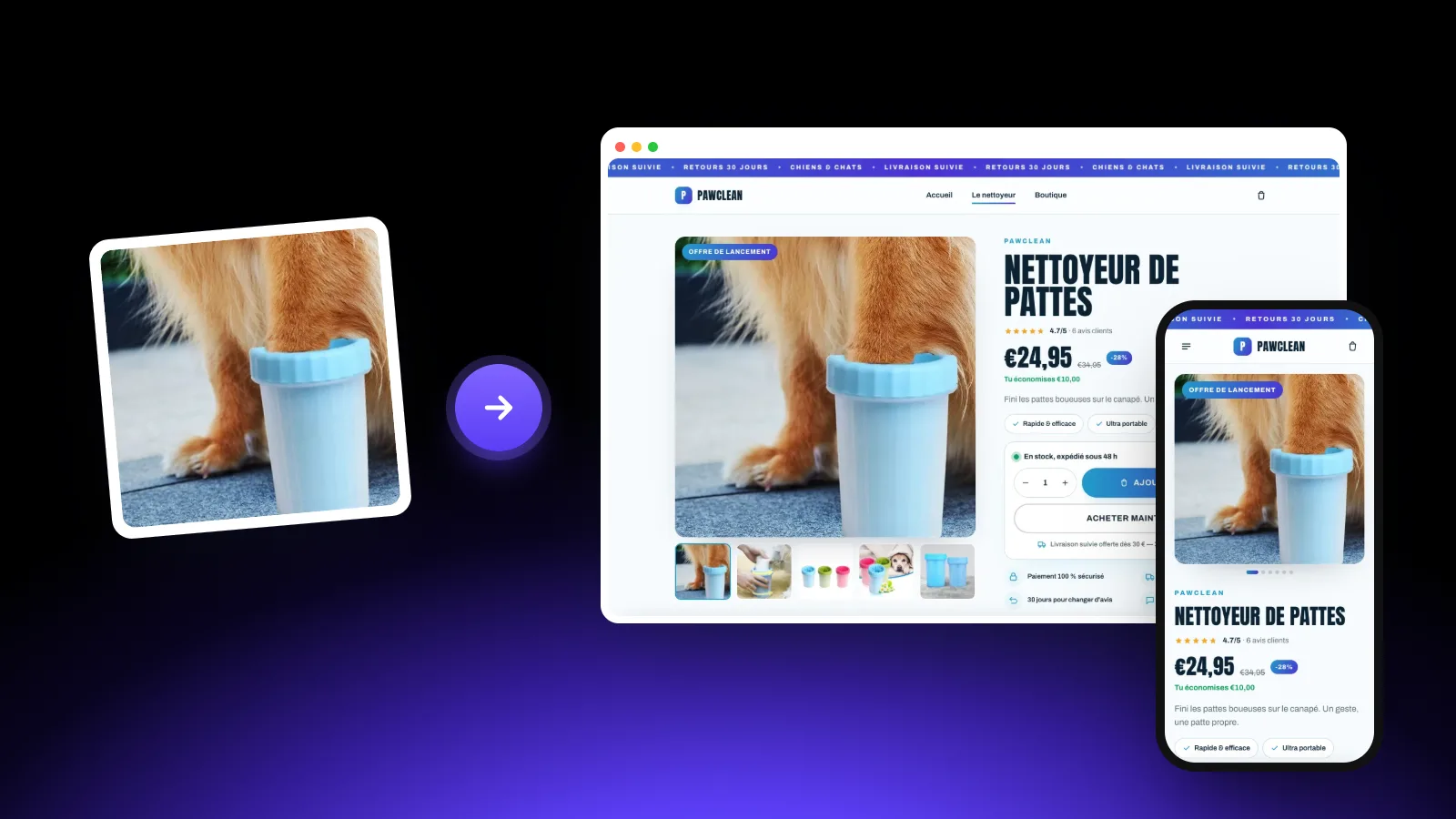
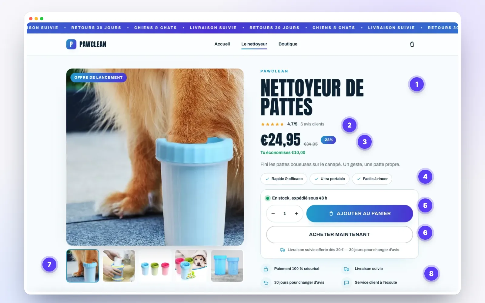
Here are the 12 elements we put on every product page generated by ThemeDrop, illustrated with a real store.
1. A headline that says what the product does
The headline must be understood instantly: "Paw cleaner" beats a brand name alone or a keyword list copied from AliExpress ("2026 New Portable Pet Foot Washer Cup…"). Keep your brand name small above it, and the benefit right below in one short sentence.
2. Reviews visible at the top
The average rating and number of reviews, right under the headline, reassure before anything is read. One click should take visitors to the reviews section further down.
3. A clear price, and an honest compare-at price
The price must be big and readable. A compare-at price and the amount saved ("You save €10") prompt action, on one condition: the discount must be real. In France and across the EU, the reference price for an announced discount must be the lowest price you charged in the previous 30 days.
4. Three short benefits
Under the price, three bullets of a few words sum up why to buy: "Fast and effective", "Ultra portable", "Easy to rinse". Hurried visitors read this and nothing else. Pick what matters to them, not to a spec sheet.
5. An add-to-cart button you can't miss
The "Add to cart" button is the most important element on the page. It must stand out (your brand color), be large, and stay reachable while scrolling: on mobile, a buy bar that sticks to the bottom of the screen saves customers from scrolling back up. Just above it, an availability line ("In stock, ships within 48 h") removes a common doubt.
6. A second path to purchase
A "Buy now" button goes straight to checkout, skipping the cart. It suits visitors who've already decided, and there are many of them when they come from a video. Keep it less prominent than the main button.
7. Photos that show the product in use
Plan 5 to 8 photos: the product alone on a neutral background, the product in use, a close-up of a detail, scale (in a hand, next to a familiar object) and, if possible, a photo sent by a customer. Supplier photos are often used by dozens of stores: one or two photos of your own make the difference.
8. Reassurance, right under the button
Secure payment, tracked shipping, easy returns, reachable support: these four lines answer the fears that block a first purchase from an unknown brand. Place them right under the button, where doubt shows up.
9. A description that sells the outcome
Further down, the description goes deeper. Start with the customer's problem ("Muddy paws on the couch after every walk"), then show how the product fixes it, with one photo per idea. Keep technical specs for a table at the end: they reassure those who look for them without weighing down the rest.
A simple comparison (your product against the usual alternatives) also helps customers decide: they see at a glance why your product is better for them.
10. Bundle offers to raise the order value
Offering the product by 1, 2 or 3, with a small discount from 2, often lifts the average order: many customers buy one to give away. Highlight the most chosen offer and show the total price and the saving clearly.
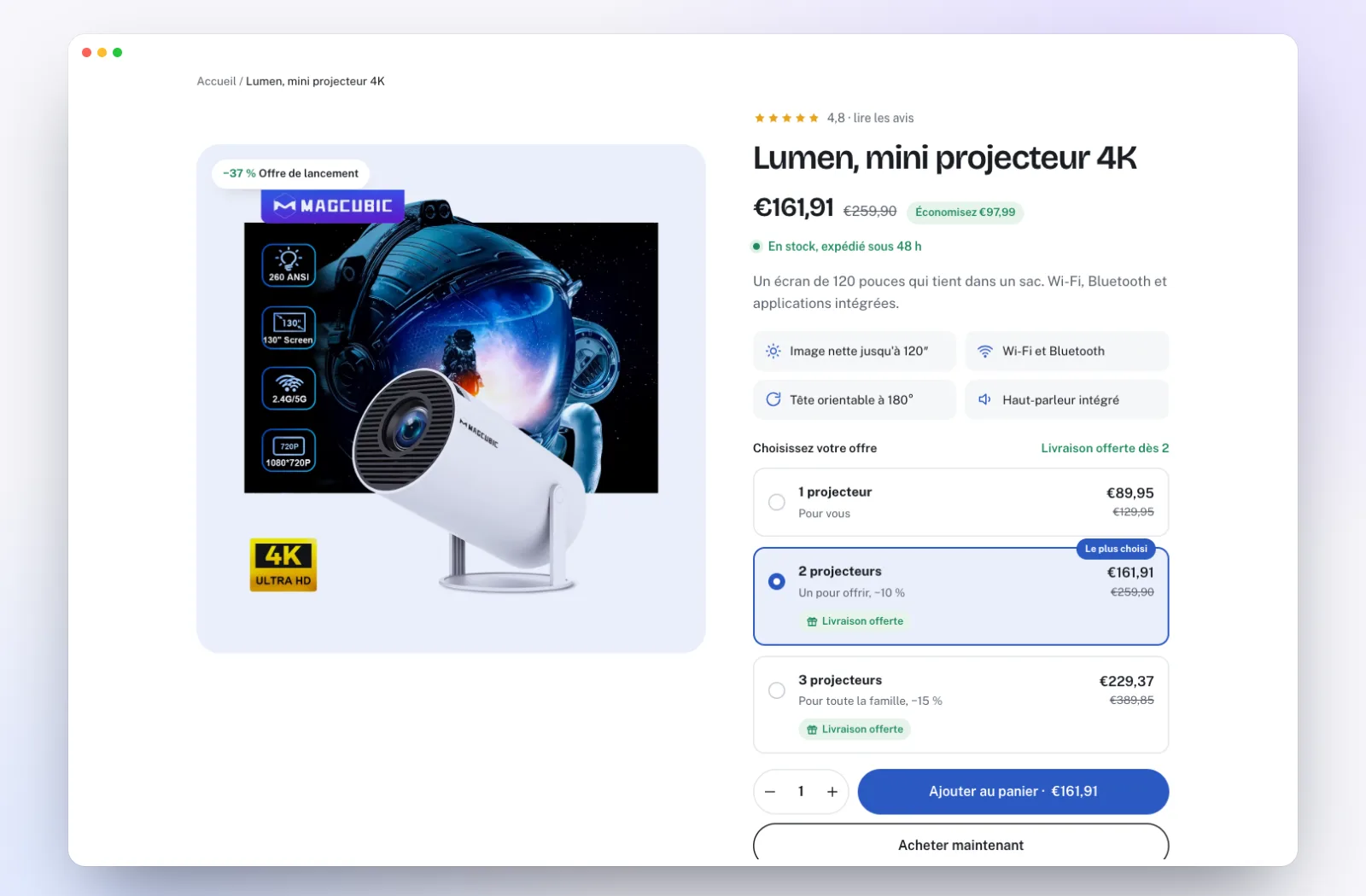
On Shopify, the simplest way is to create each offer as a variant of the product ("1 item", "2 items"…), with its own price: no paid app needed. ThemeDrop's Pro Generator creates these variants automatically.
11. An FAQ and a guarantee that remove the last doubts
The 4 or 5 questions your customers really ask (delivery times, use, care, returns) deserve an answer on the page, in a collapsible FAQ. Add a clear guarantee ("30 days to change your mind"): it's often what tips the purchase.
12. A page designed for mobile first
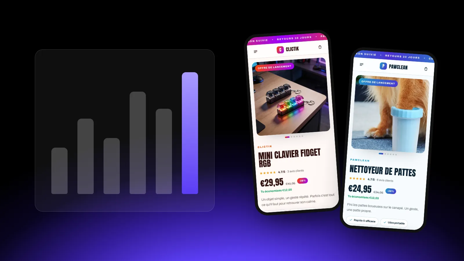
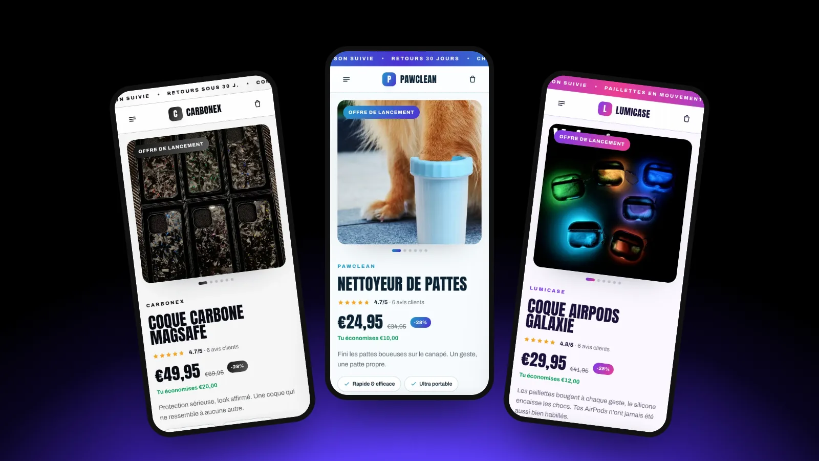
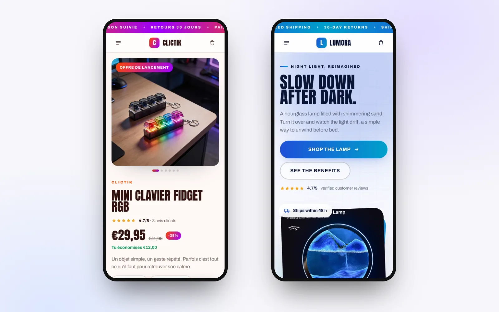
Most of your visitors will arrive on a phone. Check your product page on a real phone: big photo on load, price and button visible without scrolling, short copy, no section spilling off the screen.
The product page checklist
| Element | The question to ask |
|---|---|
| Headline | Is it clear what the product does in 2 seconds? |
| Reviews | Are they visible at the top, and all genuine? |
| Price | Does the compare-at price match a real recent price? |
| Benefits | Three short, customer-focused bullets? |
| Button | Visible without scrolling, always reachable on mobile? |
| Photos | 5 to 8, at least one in use? |
| Reassurance | Payment, shipping, returns, contact under the button? |
| Description | Does it start with the customer's problem? |
| Bundles | Is the most chosen offer highlighted? |
| FAQ and guarantee | Do the real questions get an answer? |
| Mobile | Tested on a real phone? |
A complete product page in under a minute
Paste an AliExpress link: ThemeDrop builds the product page with these 12 elements, ready to import into Shopify.
Frequently asked questions
How long should a product description be?
Long enough to answer every question, no more. In practice: a hook paragraph, three or four benefits each with an image, then technical specs in a table.
Can I use the AliExpress supplier's photos?
It's common to start with, but these photos are used by many other stores. Add at least one or two photos or videos of your own, shot with a sample.
How do I get reviews when starting out?
Send the product to a few friends or your first customers and ask for an honest review, ideally with a photo. Never make reviews up: it's illegal and destroys trust.
Should I show delivery times?
Yes, honestly. A clear time frame ("delivered in 5 to 10 business days") prevents bad surprises, worried messages and disputes.
Ready to launch your store?
Paste an AliExpress link: your Shopify store is ready in under 30 seconds. The first one is free.